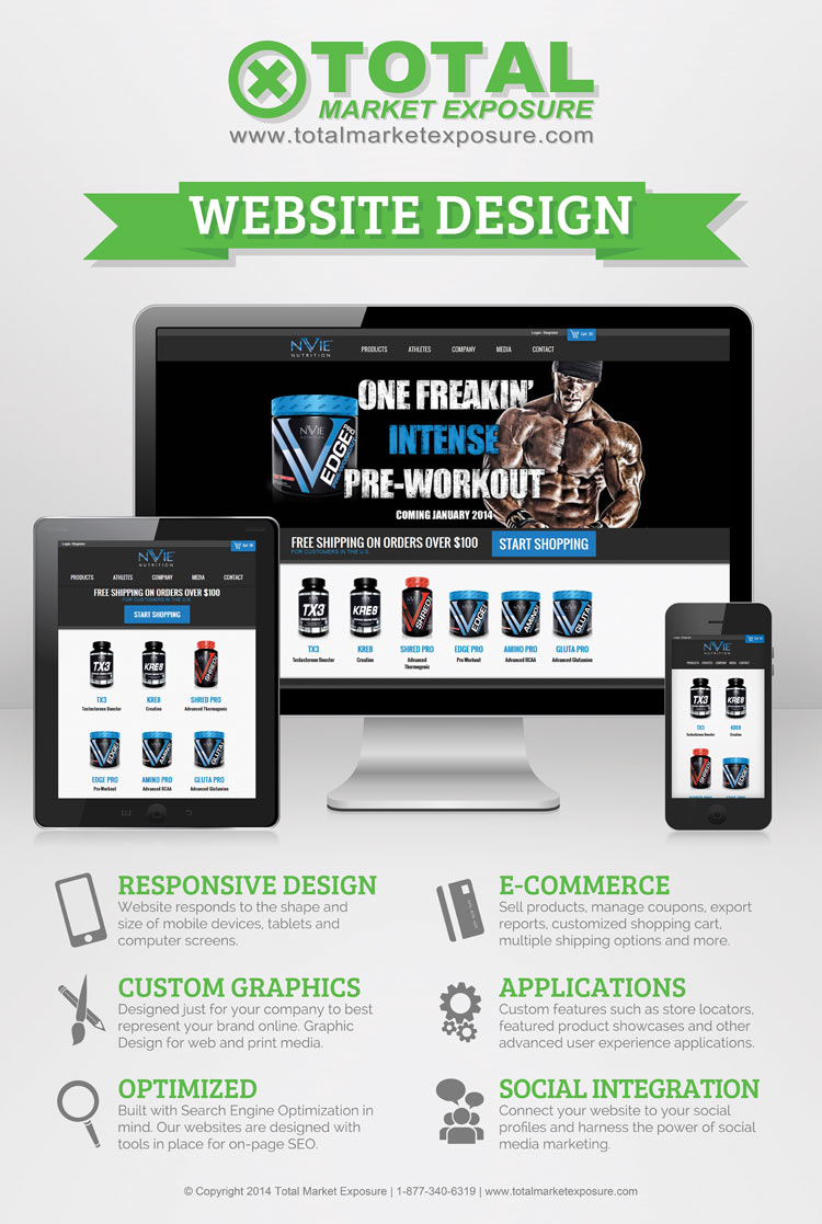
As you can see the website was redesigned to be responsive on all devices. No matter what kind of device you are using, you will get a consistent, clean user interface to experience. The identity work we did for this client cleaned up their current brand representation and raised the bar to the next level. The custom graphics done on site were all created in house by our talented designers. Other website features such as E-Commerce, Store Locator, and Social Integration were included to improve the user experience and customer satisfaction.

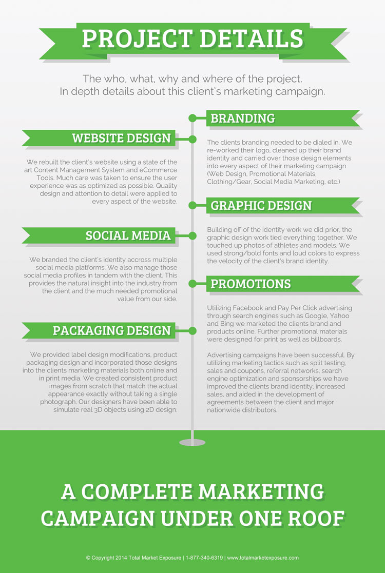
More in depth details about the project including ongoing promotions through social media marketing, pay per click advertising, content marketing, as well as print materials and more traditional forms of advertising. This image showcases how many aspects of a complete marketing campaign we handle for our clients.

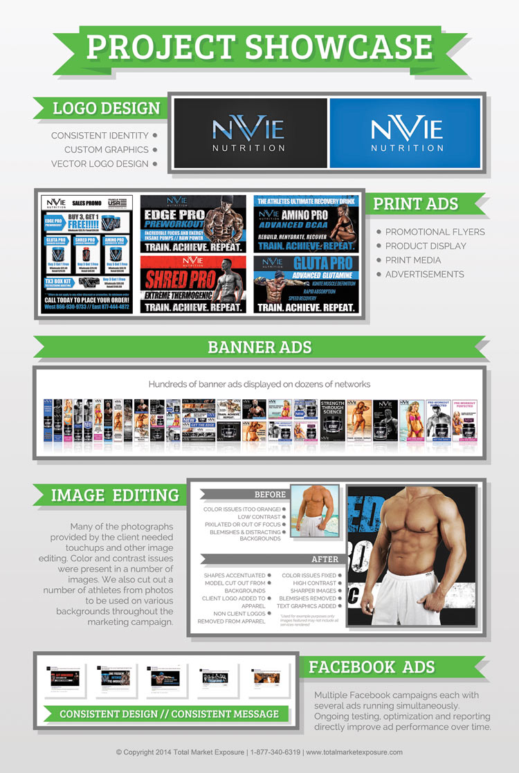
Starting off at the top we recreated the clients logo because they didn’t have access to a vector version of the logo. They liked there existing rendering of the logo and as a relatively new start up we didn’t want to cause too much confusion with their already established fan base. We rendered the logo in a similar style as the existing logo but expanded on the branding by working in a more modern color palette that carried over to their website and identity materials.
Many print ads were created for in store marketing and for their sales teams to use while meeting with clients. These directly effected the success by aiding in establishing lasting relationships with distributors and retailers.
A major display campaign was used to generate interest early in their campaign. Many of these graphics were created using their existing brand identity which is a great example of how far their brand identity has come in comparison to the print materials shown above.
Image editing was huge for this client. Each of their featured athletes provided photographs from several different photographers and events. Because of the nature of body building the colors were often quite a ways different than what we wanted due to tanning lotion, bright colorful lights at events and photoshoots in environments where lighting conditions were drastically different. We were tasked with cutting the models out of their environment, adjusting the colors to a consistent style, and several other image editing tasks. As you can see the final result is worth all the effort.
Lastly the Facebook Ads that we created are showcased at the bottom of the image above. There are only 5 displayed but several dozen have been created for the client. We consistently test and optimize all of the ads that we run for our cients, these were no different. Their Facebook Advertising campaign has been very successful.
By Sam Miller
