The web design world is an interesting and artistic environment to be in. A lot of our day is spent imagining design concepts, sketching logo ideas and testing out our ideas in Adobe Photoshop or Illustrator. When it comes time to discuss our ideas and concepts, it can often seem as if we’re speaking our own language; and in a way, we are. We use this “language” so often that we can forget that the terms we use are pretty exclusive to the design world and may not be easily understood by those who aren’t designers.
We thought that putting together a glossary of terms used within the web design and SEO community might help those who are newer to the industry or not involved in it at all, but would like to understand the terms in case they ever need to use them. This list is not a complete list of terms you’ll hear in the web design world, but it’s a good start and will cover some of the more common terms. I know this list seems pretty extensive and may be a little more than you can remember from just reading this post once, so feel free to bookmark it and return whenever you hear a term you aren’t familiar with. Please feel free to share this or let us know if you’d like us to add any other terms you aren’t familiar with.
A
Alignment
The position of the elements within your design (graphics, text, etc.). You can control the position of items so that they align to the page and/or each other.
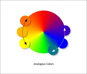
Analogous Colors
Groups of colors that are adjacent to each other on the color wheel. One color tends to be a primary or secondary color, while two on either side are usually complimentary.
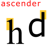
Ascender
The portion of a letter that appears above the midline of the font.
B
Baseline
The invisible line on which all of a font’s letters sit.
C
Cap Height
The total distance from the baseline to the top of the uppercase letters.
CMYK Color Model
CMYK stands for cyan, magenta, yellow and key(black). It’s a color model used in color printing and describes the four colors which are combined to make other colors.
Color Wheel
A circle of colors that shows how primary, secondary and tertiary colors relate to each other.
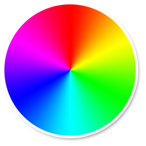
Color Schemes
A color scheme is the combination of two or more colors from the color wheel. A color scheme is usually comprised of colors that work well together.
Complementary Colors
These are colors that complement each other and are located on opposite sides of the color wheel.
Contrast
The difference in color and brightness of objects within the same field of view.
Crop
Removing outer portions of an image that are not needed as part of the desired final image.
CSS
Code used to control HTML code and specifies the way portions of the website look and function.
D
Descender
The portion of a letter that appears below the baseline.
Dot Per Inch (DPI)
Dots are used in digital printing and are comparable to what pixels do for the web. DPI specifies how many dots are used within an inch. The higher the DPI, the higher the resolution of the printed object.
Drop Shadow
An effect that makes it appear as if an object has a shadow behind it.
E
Extenders
The portion of a letter that extends below the baseline or above the x-height (ascender, descender)
F
Feathering
A technique used in computer graphics to smooth the edges of a feature.
Font
Specific styles of letting. Examples would include Courier, Geneva or Times New Roman
G
GIF
An image file format that is typically used for small files with limited color and design. Multiple GIF images can be combined to make an animated GIF, which appears as if it’s moving.
Grid
A map of horizontal and vertical lines that are used to help align text and images within a graphic design or webpage layout. It does not show up in the final product.
H
Hex Code
A hex code (hexadecimal) is a six-digit number used to specify color combinations used to create a final, specific color. For example, the Hex code for black is #000000.
HTML
HTML stands for HyperText Markup Language. It is the code used to specify the layout and content of a website. The HTML is then control by the CSS code.
Hue
Hue is another term for “color”
J
JPEG
An image file type that is best used for graphics that have smooth transitions in color. It allows for very little perception of quality loss.
K
Kerning
The individual space between letters.
L
Leading
The space between lines of type.
M
Midline
The distance between the top of lowercase letters and the baseline.
O
Open Type Fonts
Open Type is the standard format for fonts. It includes printer versions and screen versions and works on both Mac and Windows computers.
Orphan
A short line or word that appears by itself at the end of a paragraph or at the bottom of a page.
P
A file format which is commonly used for documents
Pixel
Tiny squares that are used to create an image on a computer. The smallest part of an image. The more pixels per inch (PPI), the higher quality the image will be.
![]()
PNG
An image file format for graphics that have large areas of similar color or have transparent backgrounds.
R
Rectangular Colors
A group of four colors that is comprised of two pairs of complementary colors. Also known as Tetradic Colors.
RGB Color Model
RGB stands for red, green and blue. Colors are created by combining these three colors in specific amounts. Computer monitors transmit light in these colors, so this color model is the standard model used for web design.
S
Saturation
The intensity or brightness of a color.
Serif
A small line attached to the end of a stroke in some fonts.
Shade
The amount of black that’s mixed in with a color hue.
Split Complementary Colors
On the color wheel, it involves a base color and the two colors next to its complementary color.
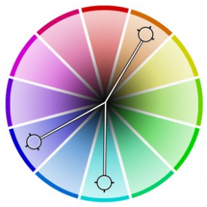
Square Colors
On the color wheel, four colors that are evenly spaced from each other. Connecting the colors with lines will create a square.
Stem
The main vertical stroke in a letter.
Strokes
The lines that make up letters in a font.
T
Tail
The descending stroke in a letter which often appears decorative. The letter “Q” is a good example.
Tint
The amount of white mixed with a color.
Triadic Colors
On the color wheel, it’s a color scheme where three colors are located 120 degrees away from each other. Connecting the colors with a line would make a triangle. This is typically considered the best color scheme to use for web design.
Typeface
A collection of characters which includes letters, numbers and punctuation. Each typeface has its own unique design and is often referred to as “font”.
V
Vector
A type of graphic file which uses lines and shapes, as opposed to using pixels. When enlarged, they will retain their quality, whereas images that use pixels will lose quality with enlargement.
Visual Hierarchy
This is a design principle that focuses on the order in which the human eye perceives what it sees. It centers around placing things in particular spots according to importance.
W
Weight
The thickness of the stroke in a typeface. Examples include bold, demibold and light.
White Space
Also known as negative space. This is the area in a design that does not have anything in it and as a result, remains white.
X
X-height
The distance between the midline and baseline in a letter.
Z
ZIP
A file format in which many files are compressed into a single folder. They don’t lose their data, but the “zipped” file takes up less storage space on the computer.
